Portfolio


PF 2019
PF 2019
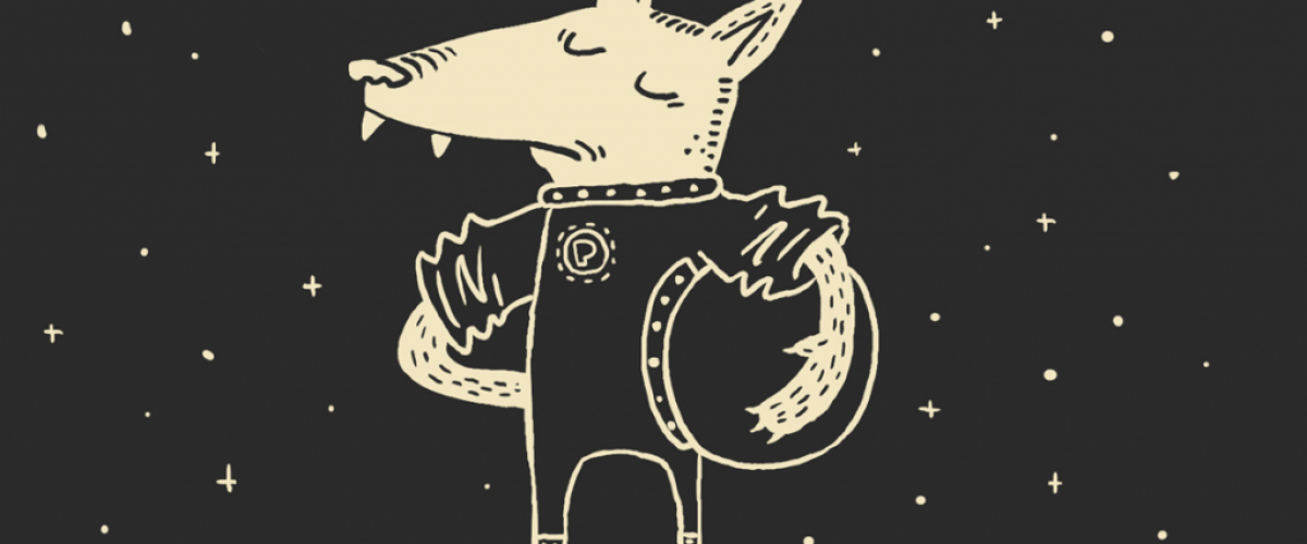
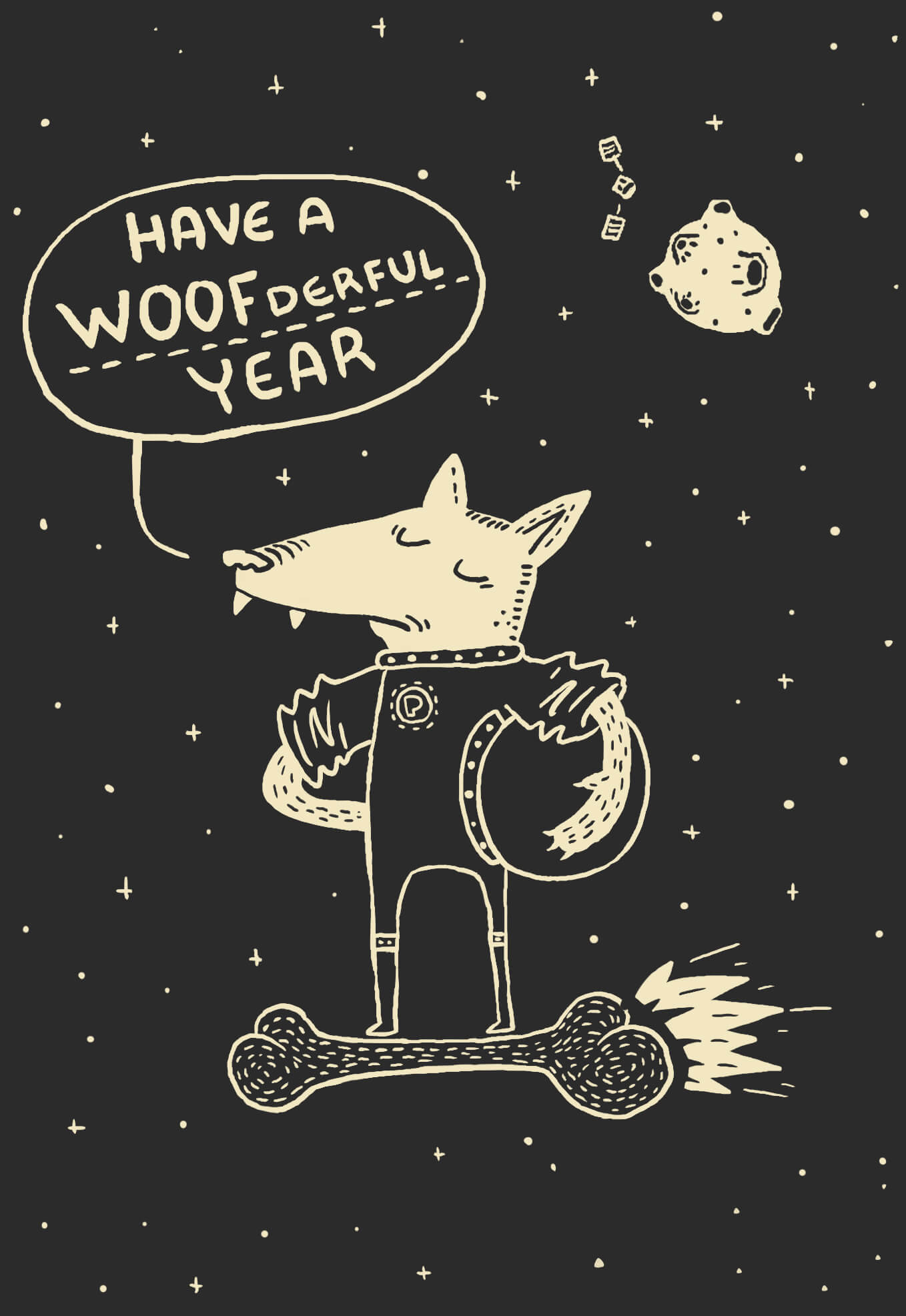
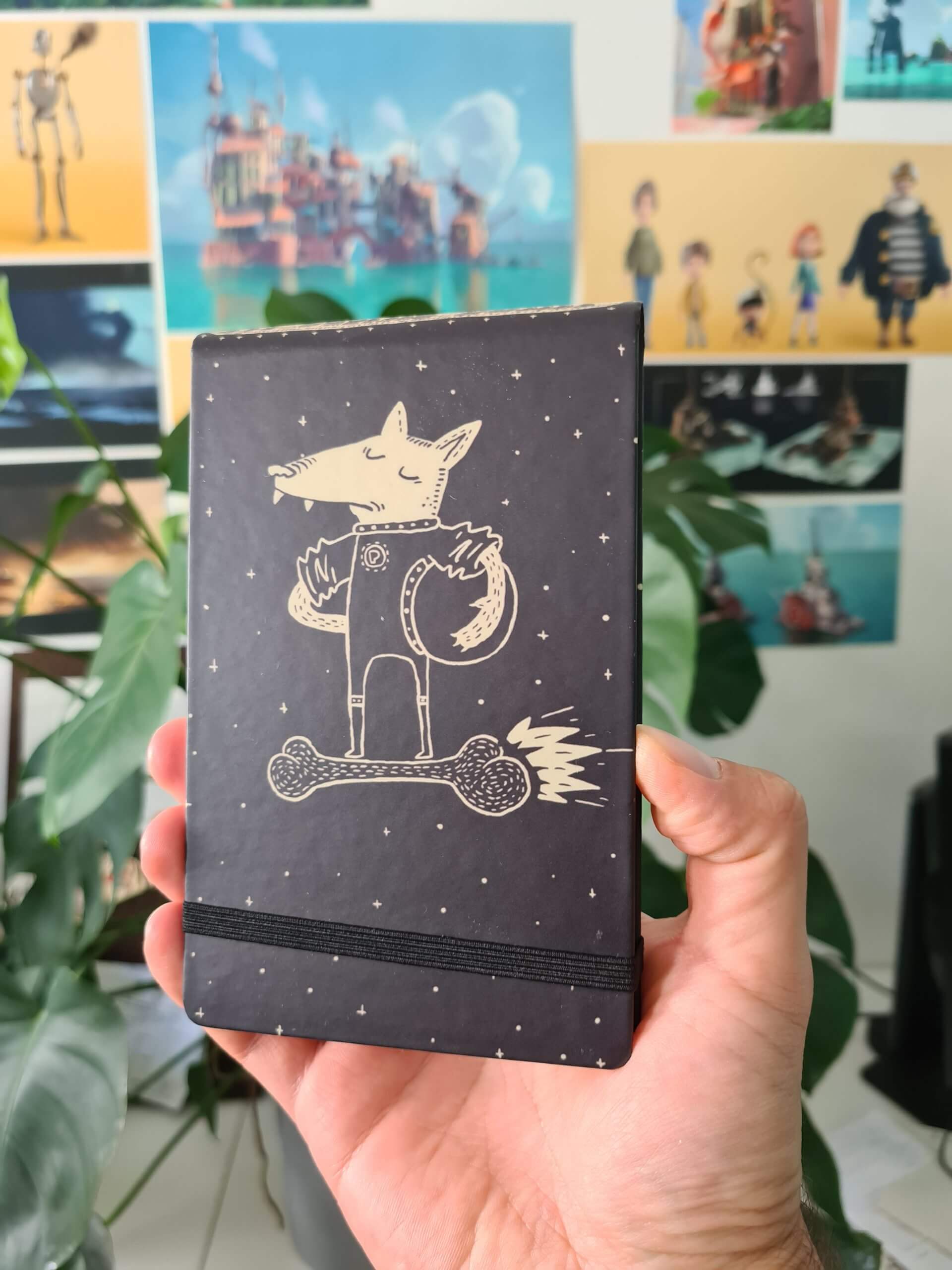
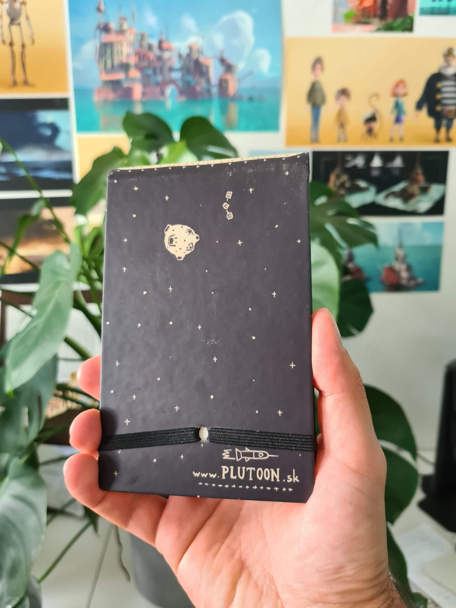
At the end of 2018 we decided to create a Christmas/New Year present for our friends and clients. It was clear from the beginning that the main character has to be Pluto. The monochromatic illustration of the superhero dog flying through space on a rocket-bone symbolically represented a “trip” to the new year.
We were also looking for the best way to get the idea to the people and that’s why we decided to print the motive onto the top of Remini notebooks.
Illustration: Peter Budinsky

Poštová
Poštová
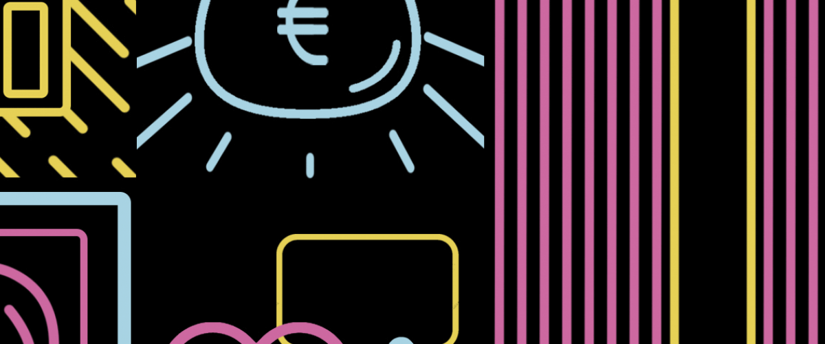
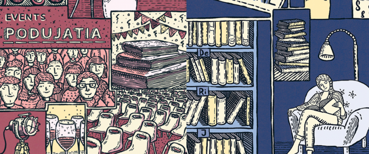
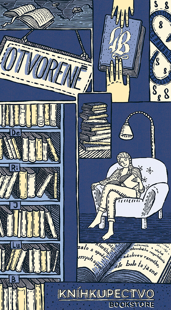
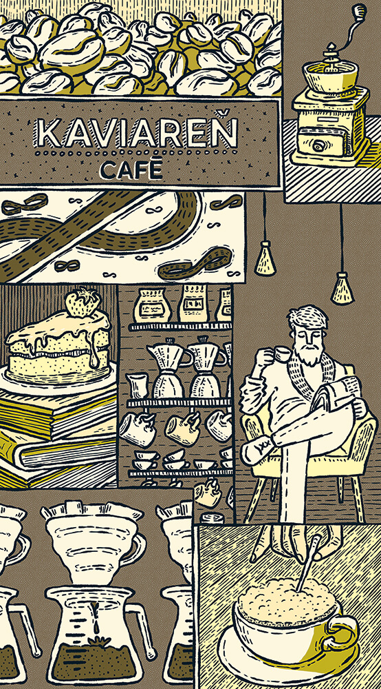
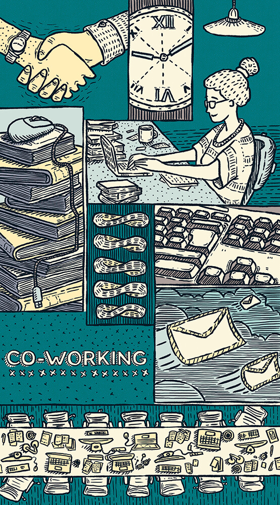
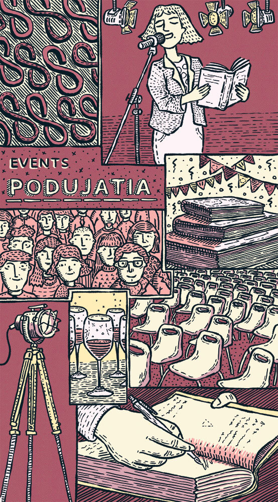
We followed up on our cooperation with Panta Rhei during the reconstruction of one of their stores in Bratislava city centre. We were given a task to create 4 large-scale illustrations, that were to be printed on special panels and placed in the display of the reconstructed space. Since after the reconstruction, the store was about to be used also as a coffee place, co-work and a venue for a number of cultural events, our aim was to present all these new activities.
Firstly, we created several concepts of the panels for the client. The winning idea is presenting a lot of different elements that are typical for each of the activities. Therefore each of the panels contains several smaller frames. Some of them contain very concrete things, some of them are filled with more abstract items or situations. Moreover, each panel has its own color palette, chosen carefully to work with the other ones.
Client: Panta Rhei
Agency: Men In Tie
Illustrations: Peter Budinsky

Zastavme korupciu
Zastavme korupciu
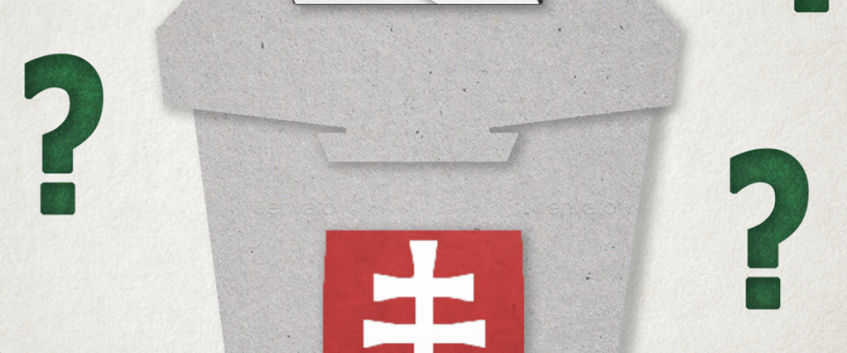
Before the election in 2020, we joined forces with a non-profit organization Zastavme korupciu and we created a 2D animation video that is showing to the viewer, how different parliament parties voted in some of the most crucial moments in the past few years. The aim of this project was to help the people to get a better view of the political scene and to decide who to vote for.
This video has a minimalistic style based on the paper structure and visual. Some parts of the video were made out of a real paper and animated frame by frame under the camera. Other parts, mainly the text, were animated digitally. The base info for the video was provided by the organization, but we were given a complete freedom in the visual style and animation and thanks to that we could use methods that are not really common and we don’t usually have time and space for those.
Client: Nadácia Zastavme korupciu
Visual concept, assets and animation: Kamila Kucikova
Sound: Michal Dzadon

Safety video
Safety video
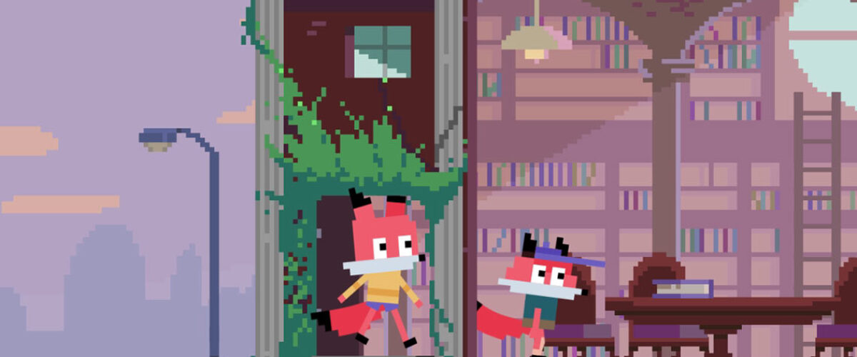
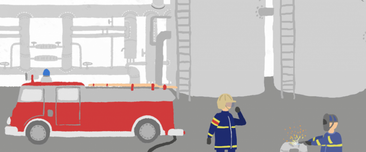
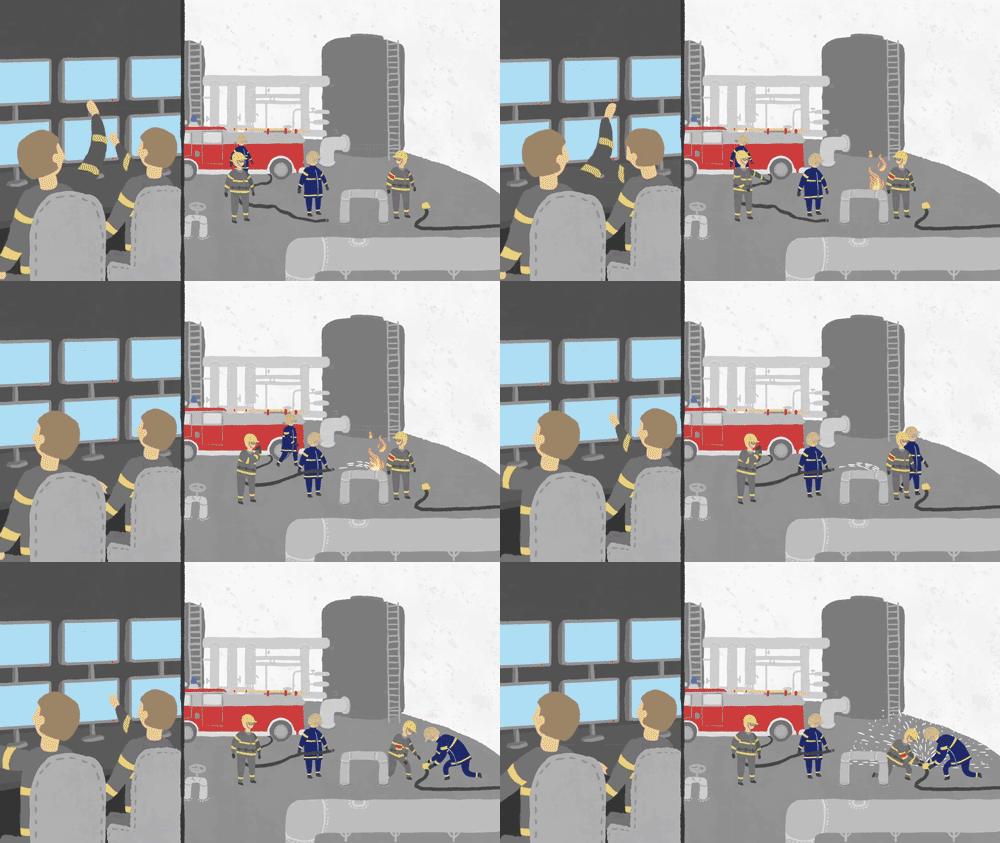
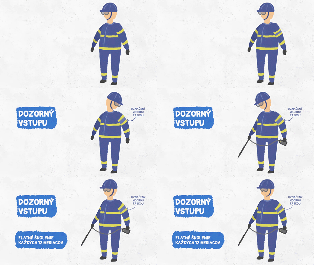
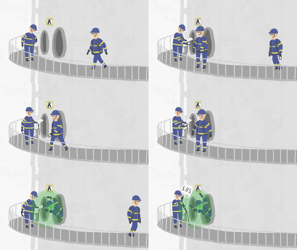
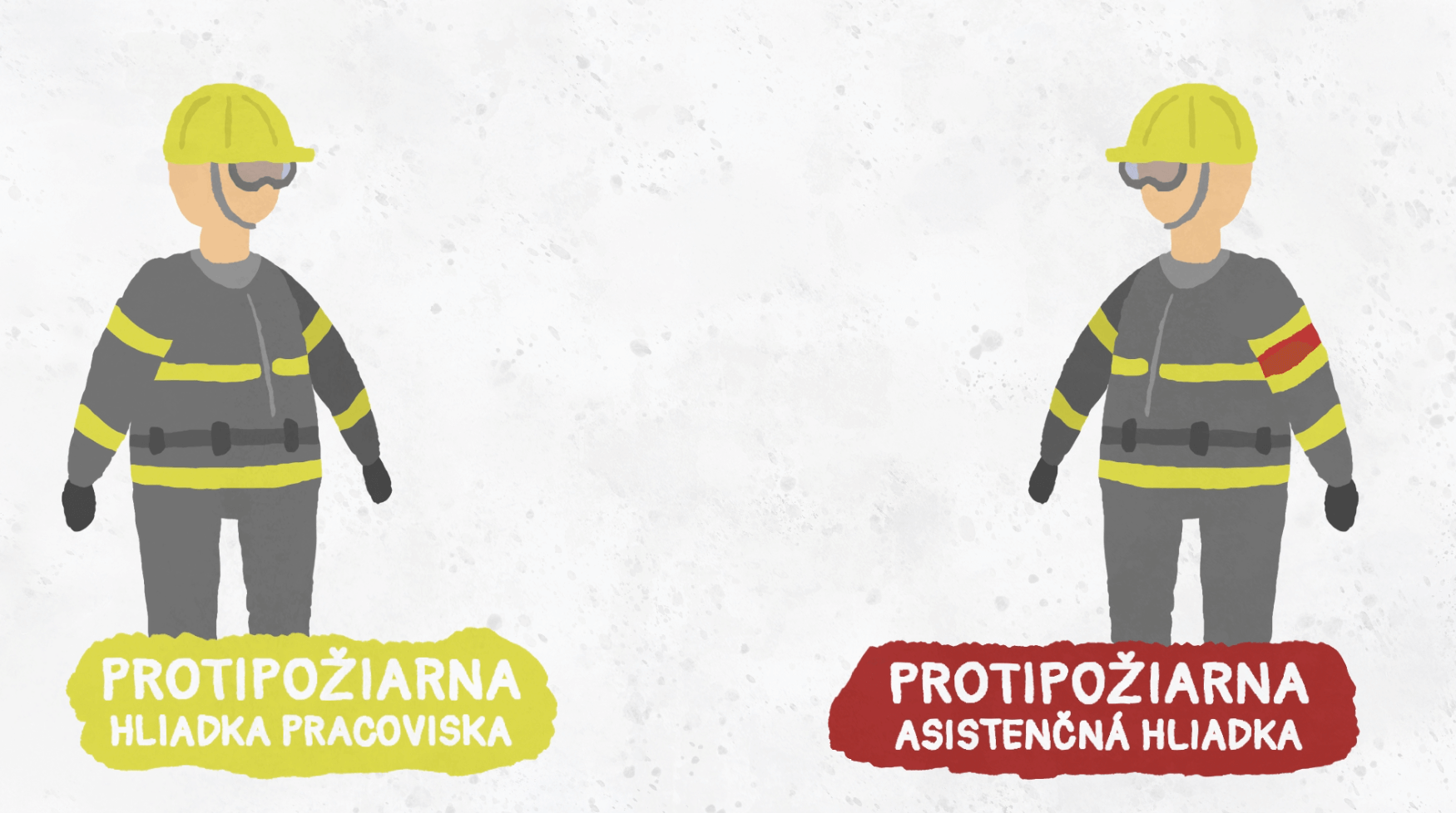
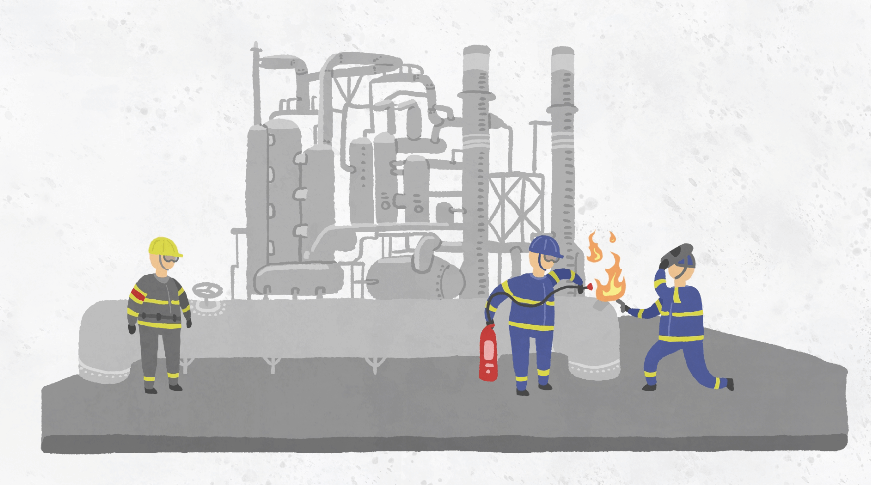
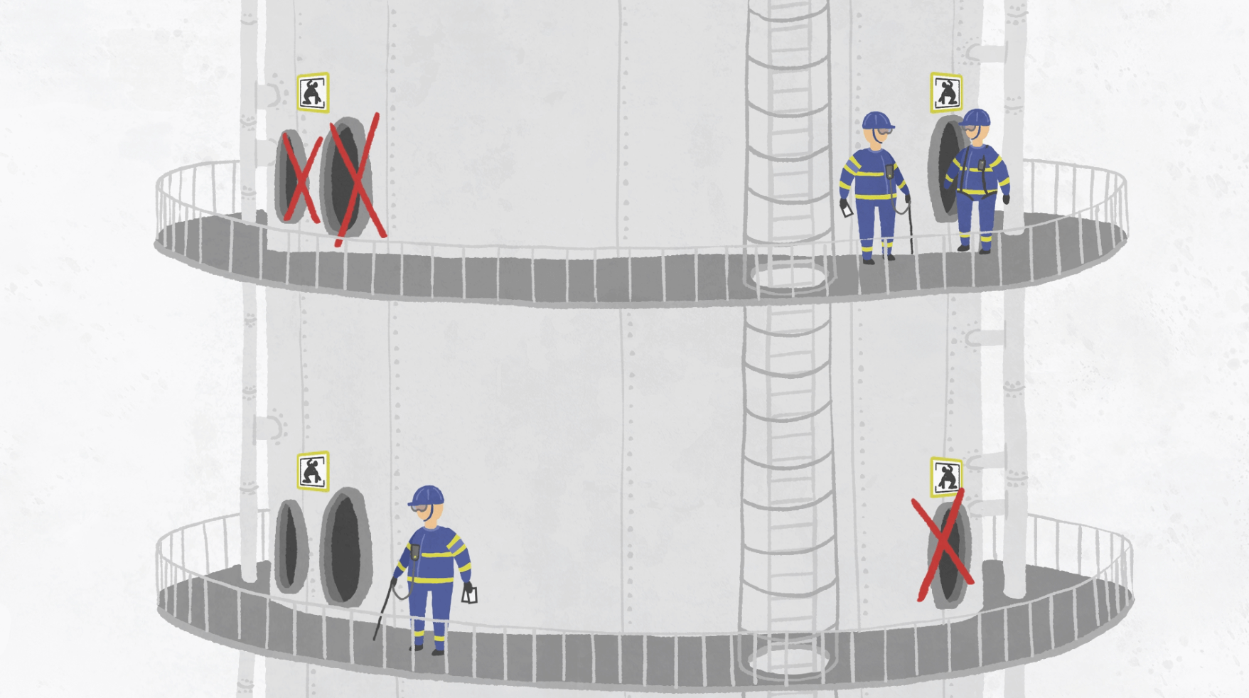
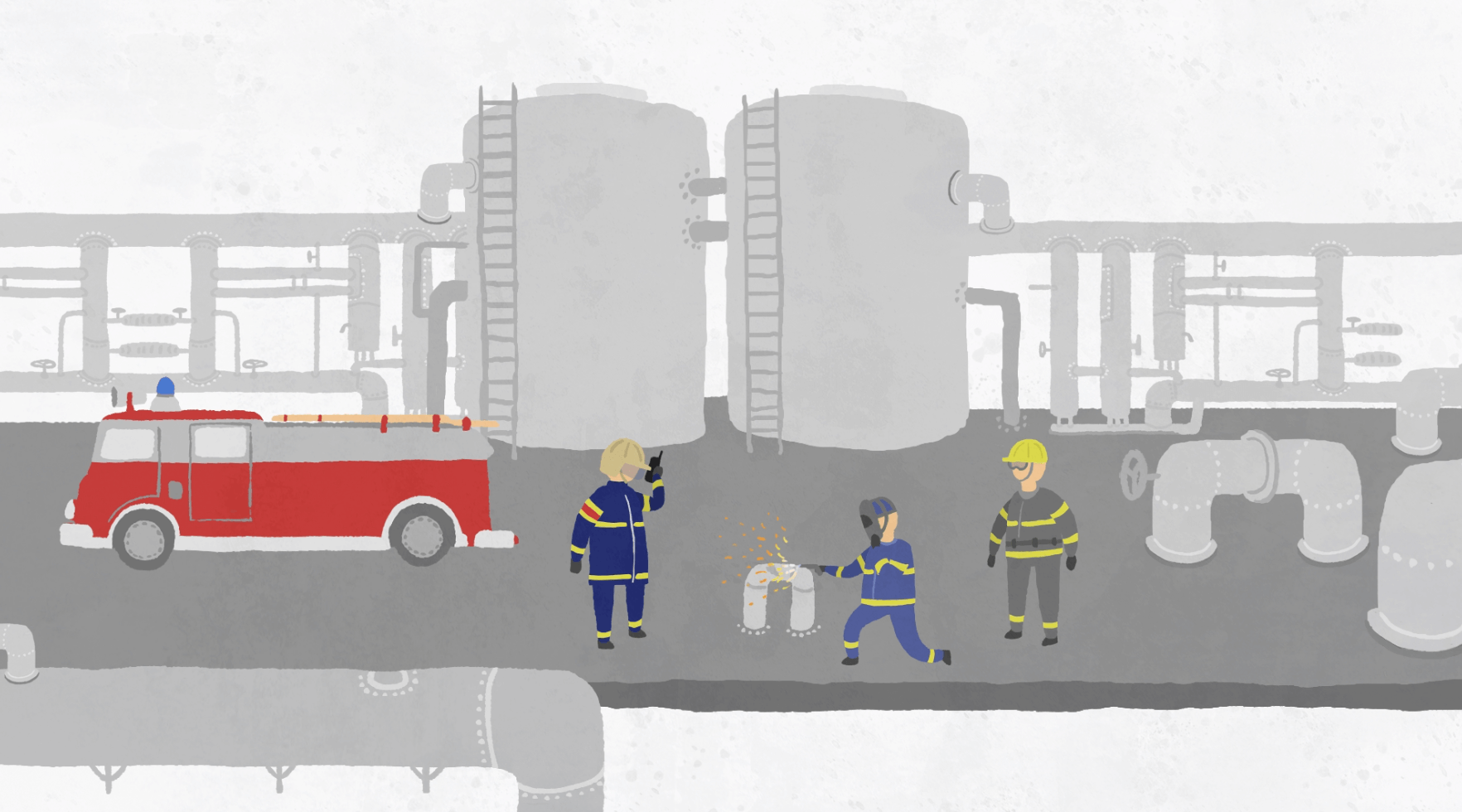
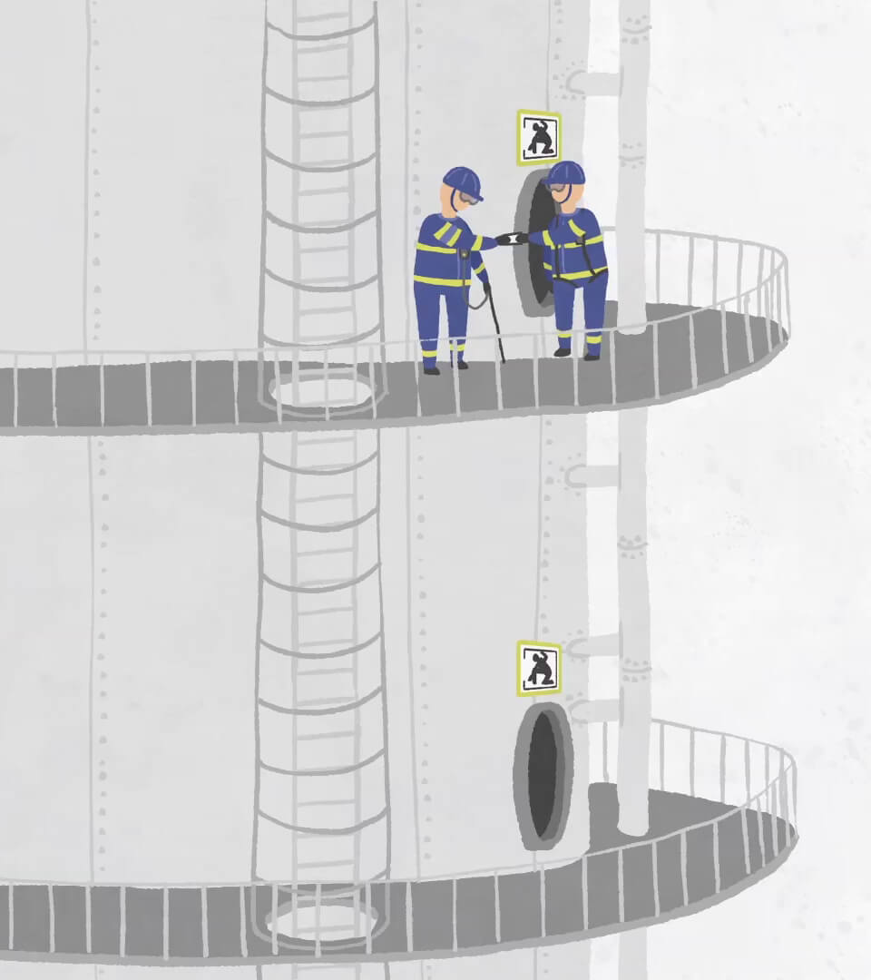
For our client Slovnaft we created a 2D animation video, that is showing and explaining different rules and duties for the employees and external suppliers that they need to know and use while working in the company especially during critical situations. The video has a simple visual style and minimalist color scheme but despite very technical content, we wanted to enrich it with a little bit of humor mainly through the characters.
The production of this project was most difficult in the beginning during the script creation. There was a huge amount of information that had to be part of it and that has a very strict way how to be delivered. On the other hand we wanted to show them in the most simplistic manner, so that the viewer can very quickly understand them. We worked with numerous characters that were very similar, only differentiated by colors to show their position in the company or their work activity. The characters are moving simplistically, even in a grotesque way, they have no eyes or noses and the mouth is used only in the necessary situations. The most important information is delivered by the voiceover and infographics. The video is animated by the traditional cut-out 2D animation.
Client: Slovnaft
Script: Peter Budinsky, Barbora Budinska
Visual style and assets: Peter Budinsky
Animation: Kamila Kucikova
Sound: Michal Dzadon


Healthy titbit
Healthy titbit
“Healthy titbit with Kika” is a TV show being hosted by Kika Kocian who is cooking simple and healthy food and besides the recipes, she’s also talking about the food itself, its characteristics and influence on the human body.
For this show we created the whole visual identity and fortunately, we had a big freedom in doing that. We based our work on the discussions with the host and author of the show, on her thoughts, on the things that she likes and the moodboards that she put together. The main part of the whole identity was the opening credits. Its visual concept was then used to create different other elements for the show that are being used during editing, such as inserts, bars, strips and others. The whole concept is hand drawn and it’s based on the particular food and typical dotted red dishes that are being used hugely in the show. The videos are made as a combination of cut-out and hand-drawn 2D animation.
Visual concept and animation: Kamila Kucikova

365.Spotify
365.Spotify
Together with our client 365.bank we created an animated online video for Spotify. Since 365.bank already has their own visual and way of communication set up, this project is not stepping out of it, it works with well-known characters, visual elements and typical color palette. The target group of this project are young people used to “live” in an online space and the visual style and the dynamics of the animation are adjusted to them.
For this particular cooperation, we got a ready storyboard from the client. It was necessary to create all the assets for the animation and together with the sound studio we then recorded the voiceover and music. Taking into consideration the trends in online communication, we wanted the video to work also without the sound so we placed key words from the voiceover directly to the video. Since Spotify is being used on different platforms, we created the video both in horizontal and vertical versions.
Client: 365.bank
Assets: Peter Budinsky
Animation: Matej Babic, Peter Budinsky
Sound: Michal Dzadon